Why a Small Business Needs Good Branding
Branding work is tricky, because when it’s done really well, you don’t notice it. But when it’s done poorly, it’s pretty obvious.
The logo, colors, fonts (a.k.a. typography), and images used to represent any brand or company are no accident. It’s work that’s done carefully, thoughtfully, and meant to stand the test of time. It represents a company’s mission, vision, and purpose – all in one set of graphics that are repetitively used.
Getting branding work done can seem unnecessary, especially for a small business. But as someone who’s worked in marketing and branding for 15 years, I know the importance of it.
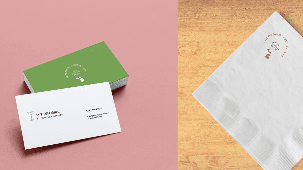
Mitten Girl Branding
I founded Mitten Girl LLC 18 months ago. When I launched the company, I did so using a logo I created myself using free graphics and fonts. And while this has been fine, as my work begins to grow, I’ve found myself wanting more professional looking branding that I can use for years to come.
The first time I hired a graphic designer was for the layout of Homemade Happy Hour. I was extremely fortunate that my friend Frances Close was interested in working on a cookbook and was willing to work with my super-aggressive (a.k.a. obnoxiously fast) publishing timeline.
Frances’ work on the book is extraordinary, so it only makes sense to take the design elements from Homemade Happy Hour and bring them to life within my brand. When I decided to implement professional branding for Mitten Girl, I immediately reached out to her.
Over the past few months, we’ve met, sent tons of emails, and she has built a gorgeous system of colors, fonts, and graphics to represent Mitten Girl in all the ways we could think up. Website, business cards, email templates, Pinterest pins, stickers, coasters, cocktail napkins – it’s all covered.

Planning for Success
Throughout the process of starting a business, I’m told over and over again that consistency is key. Don’t give up. Big goals take time. Keep going. Think long term. Which is exactly why creating a visual representation for my brand is an important investment.
It’s long term. It’s planning for the projects that are around the corner and the future success that’ll require me to have a logo I’m proud of. It’s setting myself up for success. And that’s worth every penny.